I transform business objectives into creative direction, ensuring the project's overall vision delivers tangible results.


ALBIM Solutions

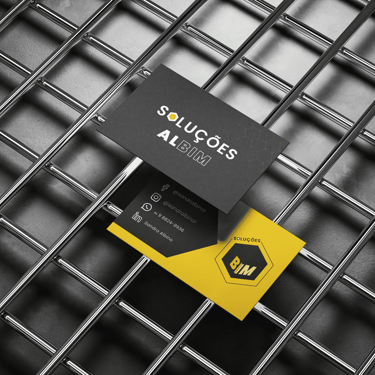
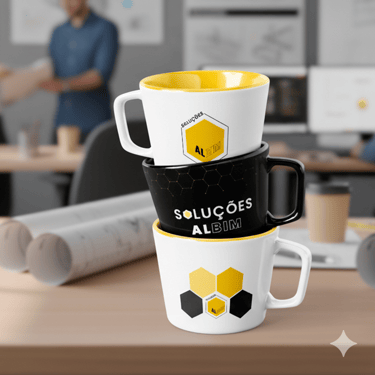

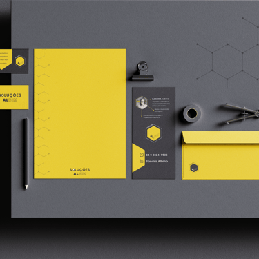

Concept
The brand ingeniously merges the term "Solutions" with the BIM acronym, creating a clever wordplay on the surname "Albino."
The logo features a hexagon, symbolizing a beehive structure to represent collaboration and seamless integration between teams.
The fine line of the "BIM" element underscores our meticulous attention to detail.
Color Palette Details
Yellow: Represents Innovation and Energy.
Grey: Symbolizes Authority and Professionalism.
White: Conveys Clarity and Precision.
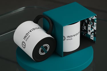
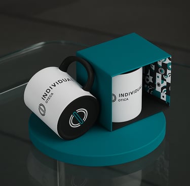
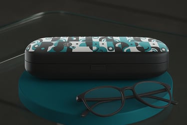
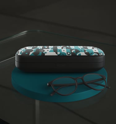
INDIVIDUAL ÓTICA
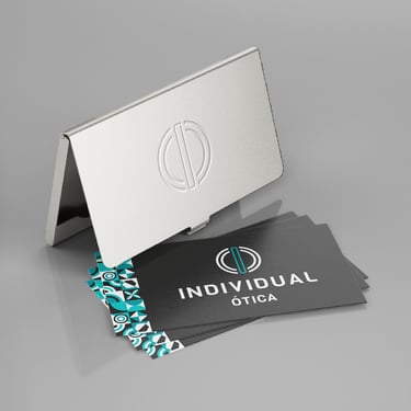
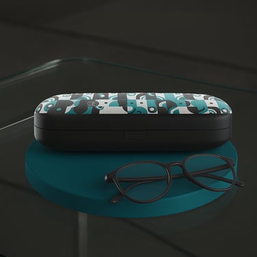
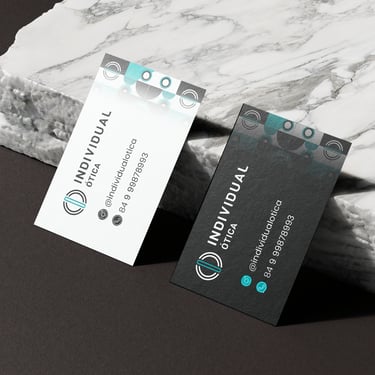
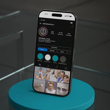
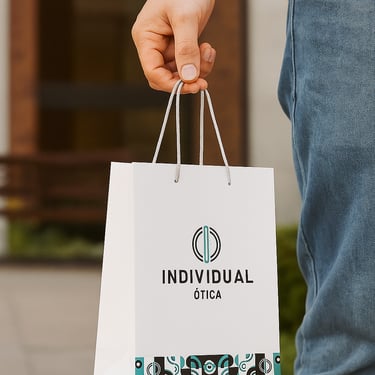
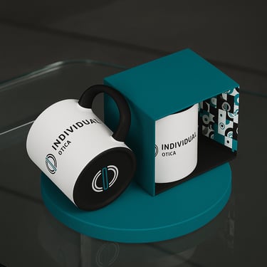
Concept
The minimalist symbol merges the letters "I" and "O" from the brand name. The letter "I" is subtly highlighted to symbolize our unwavering focus on individualized and exclusive service.
The logo’s graphic design evokes the structure of the eye and the fluid motion of a contact lens, effectively reinforcing the brand's core message.
Color Palette Details
Teal: Conveys trust and professionalism.
White: Evokes cleanliness and modernity.
Charcoal Grey: Lends sophistication and exclusivity.
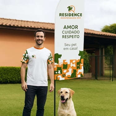
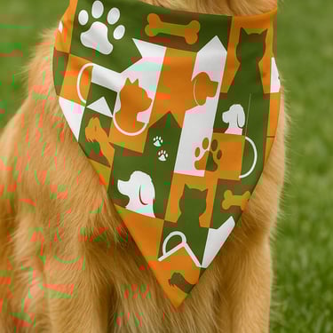
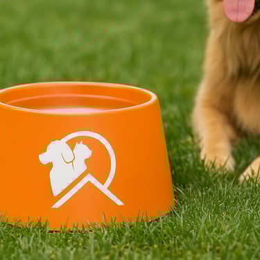
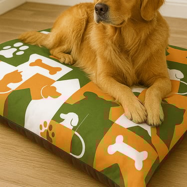
Concept
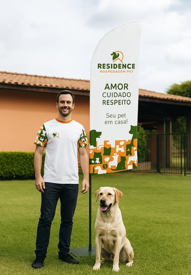
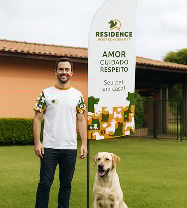
The name "Residence" evokes a deep sense of home.
The symbol is a subtle nod to the letter "R," incorporating a rooftop to reinforce the residential idea. It also includes the silhouettes of a dog and cat to symbolize unity and nurturing care.
The visual identity is complemented by graphic illustrations using the same line weight, imbuing the brand with joy and dynamism.
Color Palette Details
Green: Signifies nature and security.
Orange: Symbolizes warmth, affection, and a welcoming feel.
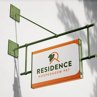
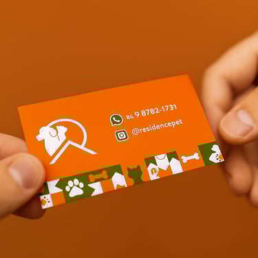
RESIDENCE PET
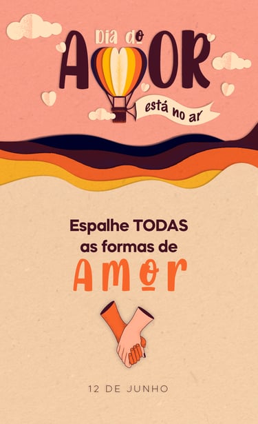
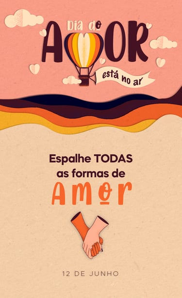
Valentine's Day

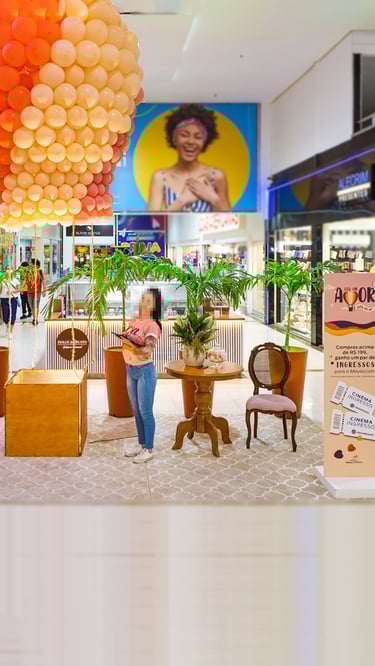
Challenge
To create a Valentine's Day campaign that steered clear of clichés and resonated with all types of couples.
Strategy
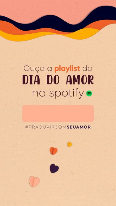
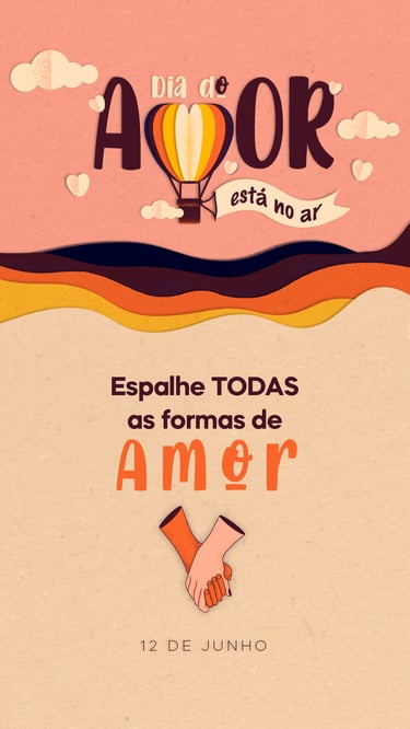
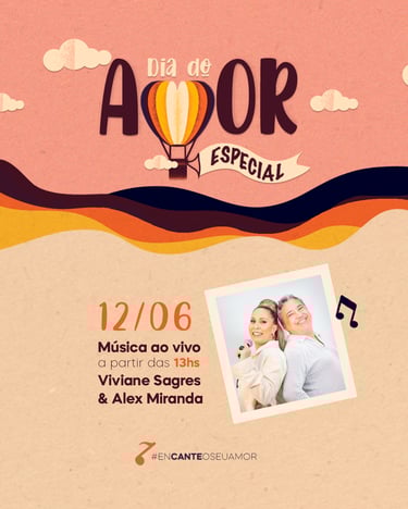
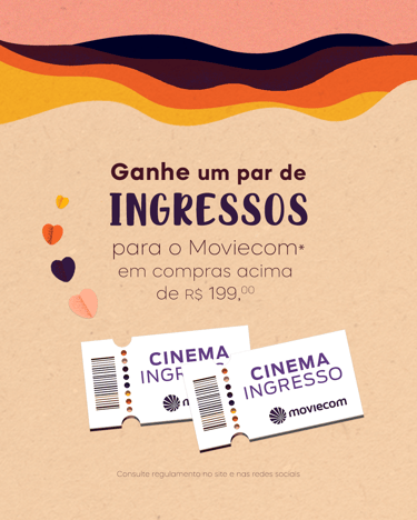
The approach featured a paper-cut visual aesthetic and handcrafted typography, utilizing a unique color palette inspired by sunset hues instead of the traditional red. The campaign also incorporated a balloon icon with a heart and the letter "M" (from the word 'amor' / love) to reinforce the narrative.
Result
A light and inspiring campaign that celebrated romance in an inclusive and memorable way.
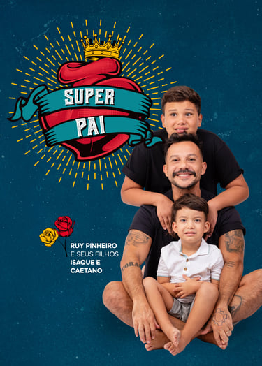
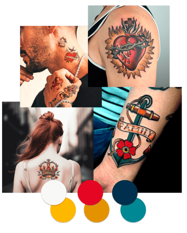
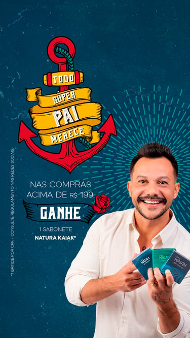
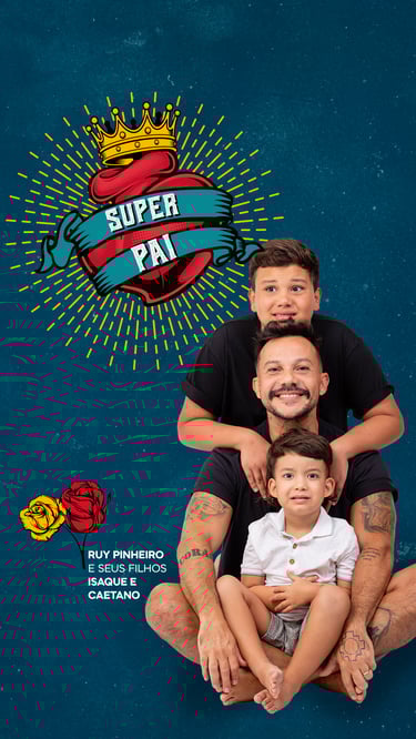
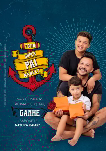
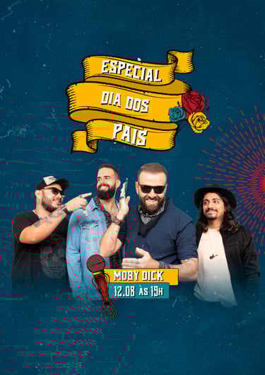
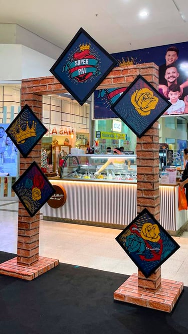
Challenge
To create a Father's Day campaign that steered clear of clichés and authentically conveyed paternal love.
Strategy
To humanize the campaign by featuring a real-life shop owner and tattoo artist with his children, instead of models.
Visual Identity
Inspired by old-school tattoo art, creating a unique aesthetic directly connected to the protagonist.
Color Palette Details
Combining the mall's existing colors with warm hues to enhance the emotional impact.
Result
A campaign that connected the brand to a genuine story, generating identification and a memorable emotional impact.
Father's Day
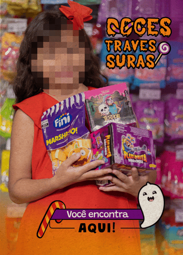
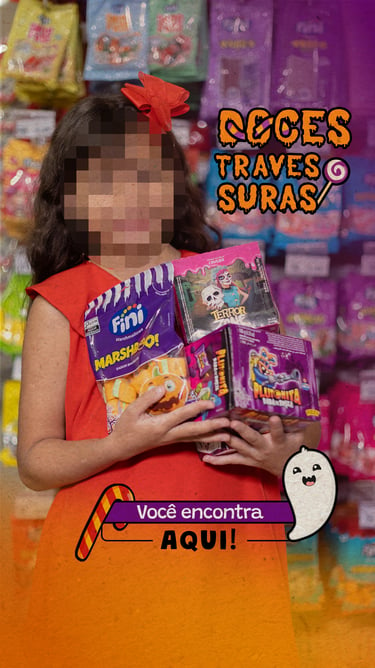
Challenge
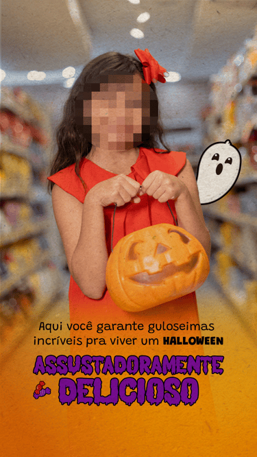
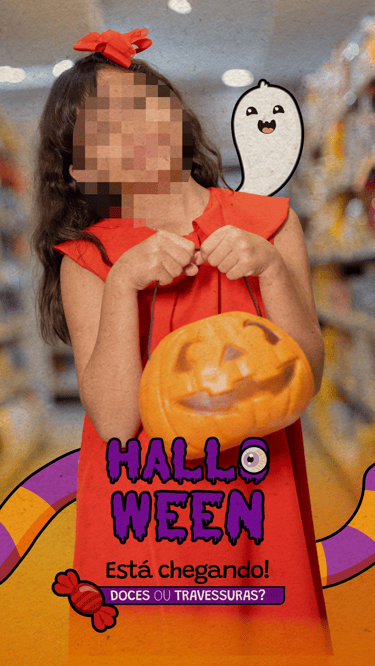
To establish the brand as the go-to destination for securing Halloween candy while steering clear of the obvious.
Strategy
The approach was twofold, combining human connection with a unique visual identity:
Humanization: Featuring a child who personified 'sweetness', thereby creating an emotional connection with the audience.
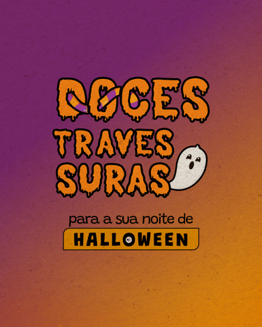
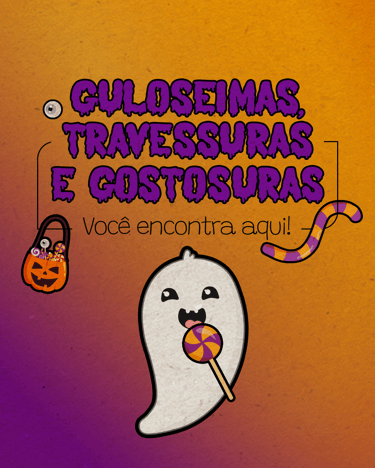
Visual Identity: We introduced purple and black to the brand's palette to create a playful and spooky atmosphere, complete with themed illustrations and typography.
Results
The campaign drove high engagement and organic growth on social media, proving that a narrative-driven content strategy builds genuine bonds and business impact.
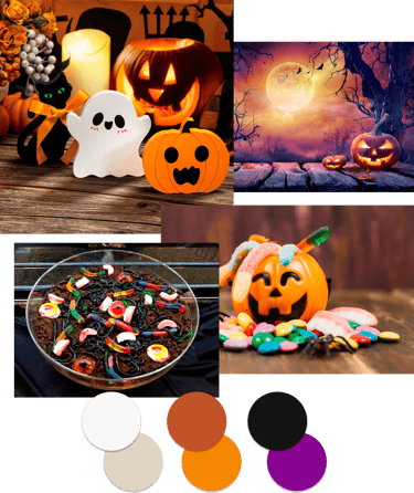

HALLOWEEN
Video Editing
My video editing expertise is a strategic tool for guiding the narrative and transforming the script into a compelling visual experience.
I don't just edit; I construct stories that are visual, emotional, and persuasive, ensuring your message is captivating and drives real impact from start to finish.
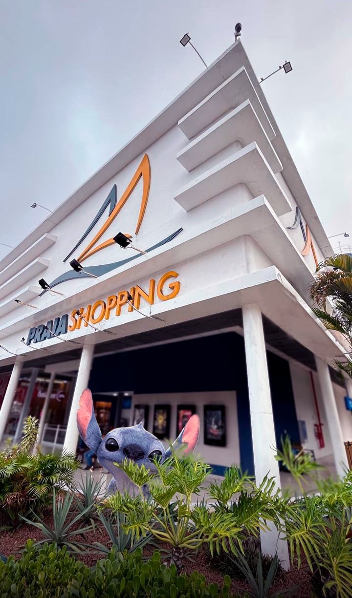
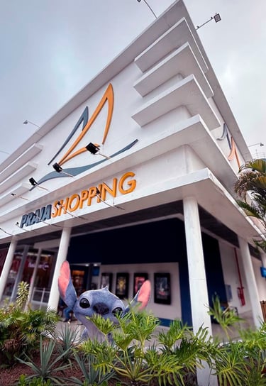
Challenge
To generate buzz and curiosity for the Stitch live-action film launch, moving beyond a simple announcement. The goal was to transform the launch into a fun experience that resonated with the audience.
Strategy
Instead of a standard trailer, the strategy was to create a narrative featuring the character in a real, everyday setting, remaining true to Stitch's irreverent essence. The editing focused on pace and humor to spark curiosity and incentivize organic sharing.
Result
The visual appeal and fun approach led to the content being widely shared, proving the success of using a content narrative to drive audience engagement and box office success.
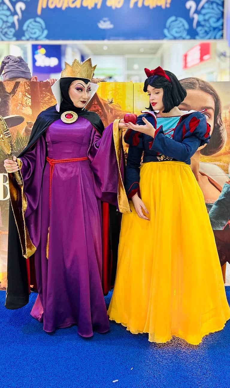
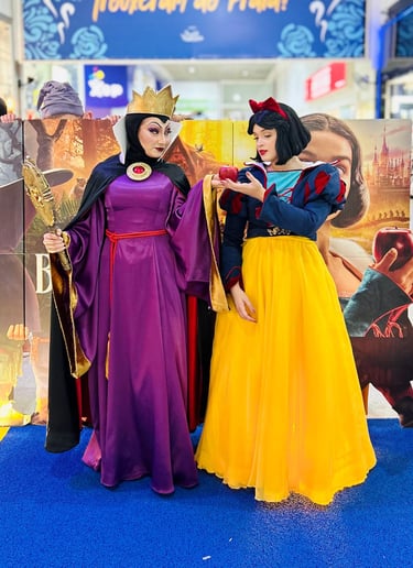
Challenge
To present a classic tale in a modern and captivating way for a contemporary audience. The goal was to spark nostalgia and curiosity without revealing the film's plot.
Strategy
The strategy involved using the live-action format to engage the audience unexpectedly. The visual narrative was built around a dramatic match cut of the story's most iconic element: the apple.
Result
The video became a highly effective teaser, generating a high volume of shares and discussions across social media. The combination of familiar elements with a creative and strategic execution secured significant organic reach, proving the campaign's success in building anticipation and driving audiences to theaters.
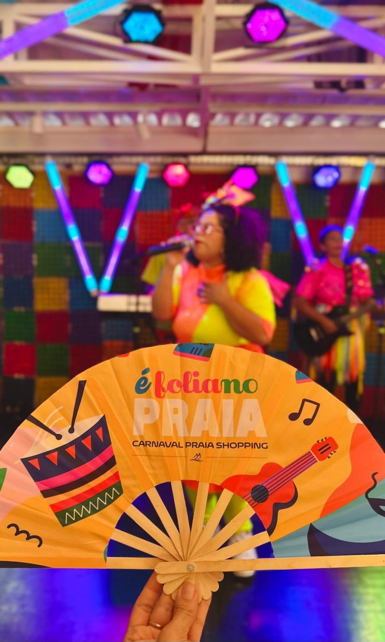
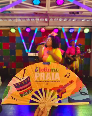
Challenge
To move beyond simple event documentation, seeking instead to synthesize the joy of the celebration into a dynamic and engaging video. The goal was to resurrect the energy, emotion, and fun of Carnival and maintain a state of heightened audience engagement.
Strategy
The editing strategy was built on intelligent match cuts to create a seamless and magical visual flow, symbolizing the event's uninterrupted energy. This guaranteed a fast-paced, captivating rhythm that celebrated the festival's essence.
Result
A high volume of interactions and shares across social media. The editing, which evoked the joy and energy of Carnival, resulted in a high number of positive mentions and organic engagement, positioning the mall as a destination for leisure and entertainment.